Arrests Map
In this first visualization, we have created a cluster map which displays each occurrence of a crime which is contained within our data set. When zooming in and out on certain areas, a user can also click on a marker which signifies a specific event, and a brief description will be provided to them regarding what transpired. A few takeaways can quickly be made with this map, and it can yield even more information upon deeper usage. First though, it is immediately clear that the West and South sides of Chicago are extremely crime heavy. Criminal activity is largely centered around the downtown area as well, as crime has picked up within the Loop and such recently. Lastly, the most violent offenses appear to occur within the more criminally active areas, whereas the crimes which occur in less criminally active areas are generally less violent. This map is a great tool, and continuing to use it will only lead to more insight going forward!
Distributions of Crime Types
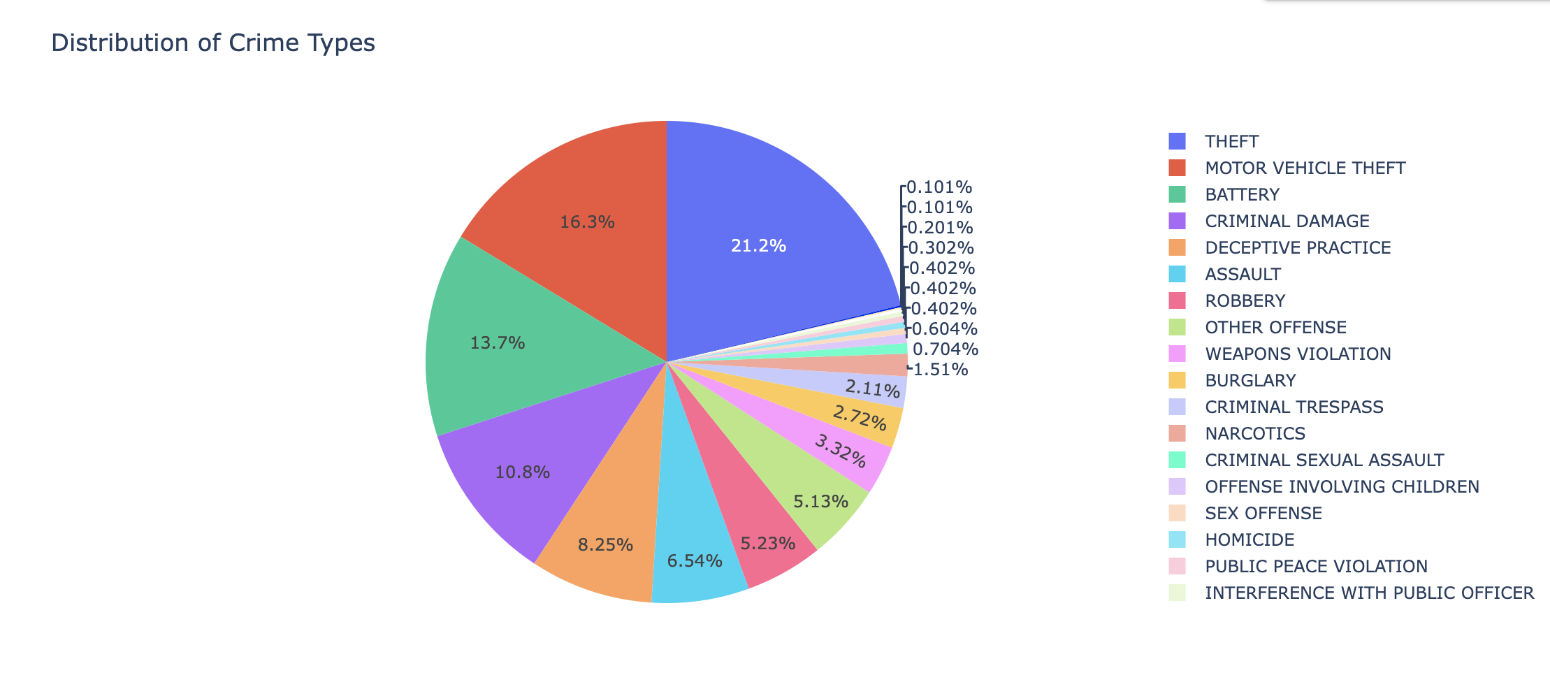
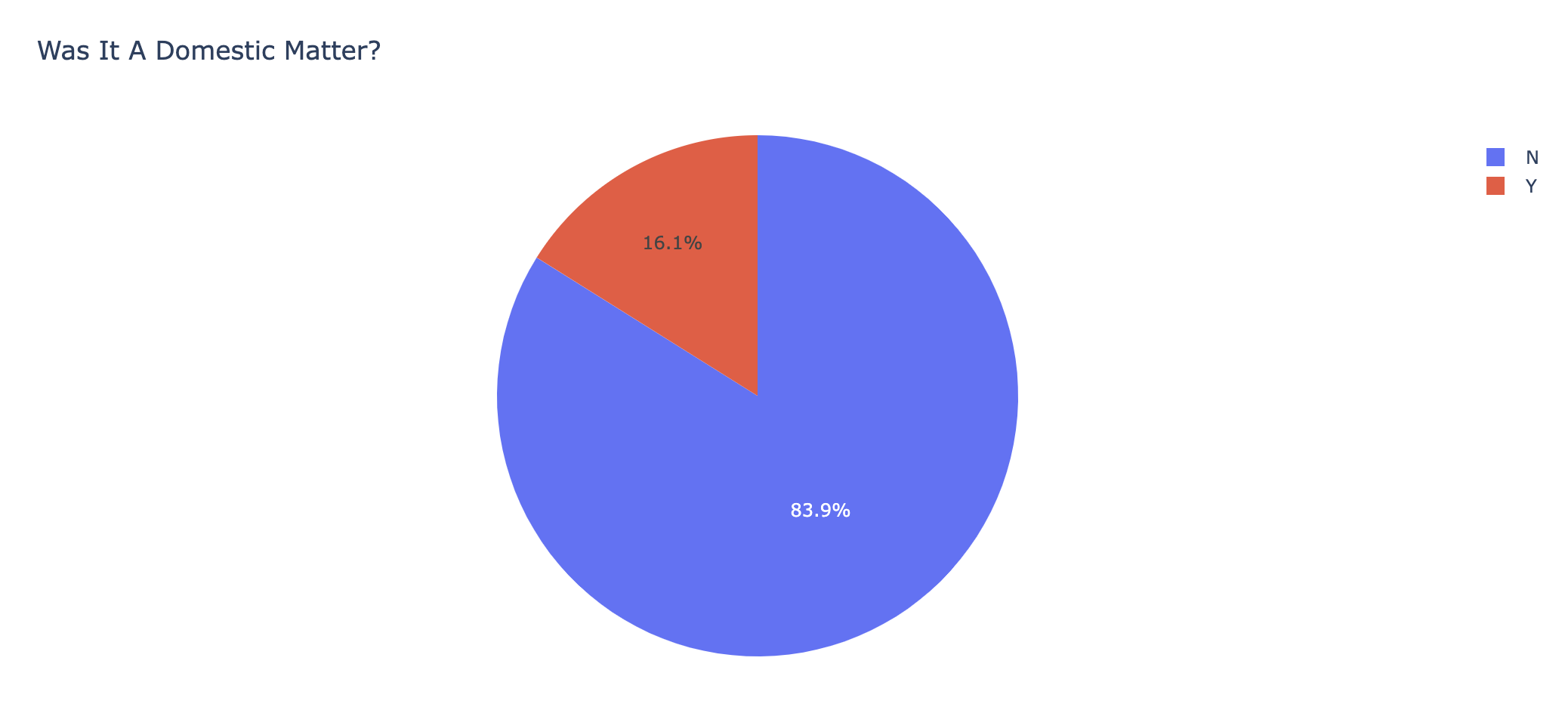
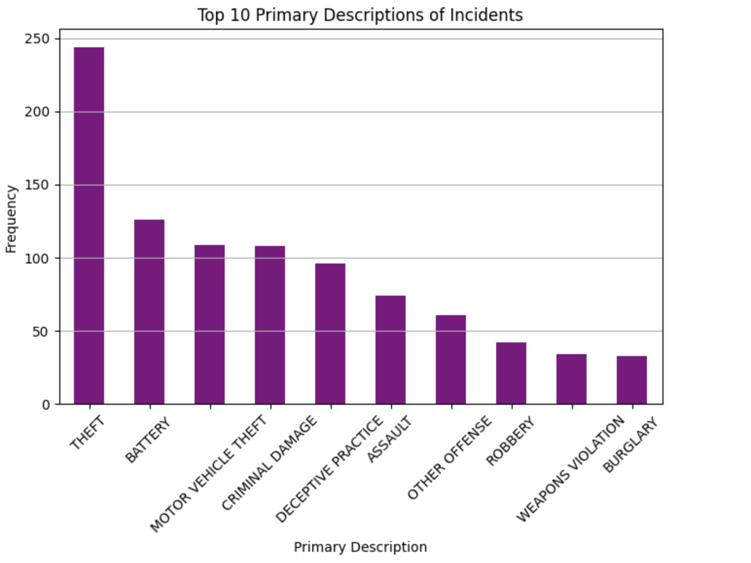
This pie chart illustrates the percentage of total crime which each distinct criminal offense constitutes. From this chart, we can see that theft is a large portion of total criminal activity, both regular (21.2%) and motor vehicle (16.3%), as well as battery (13.7%) and criminal damage (10.8%). With secondary descriptions also provided, more information can be gathered on these crimes to better tailor police activity to the more common criminal activity. We have also paired this with a pie chart which displays that most (83.9%) criminal offenses were not domestic matters, and thus occurred in public where more tailored policing habits could likely make a difference. Finally you can see a bar graph showing the frequency of the top 10 most comitted crimes which corresponds with our first pie chart.
Crime Activity By Ward
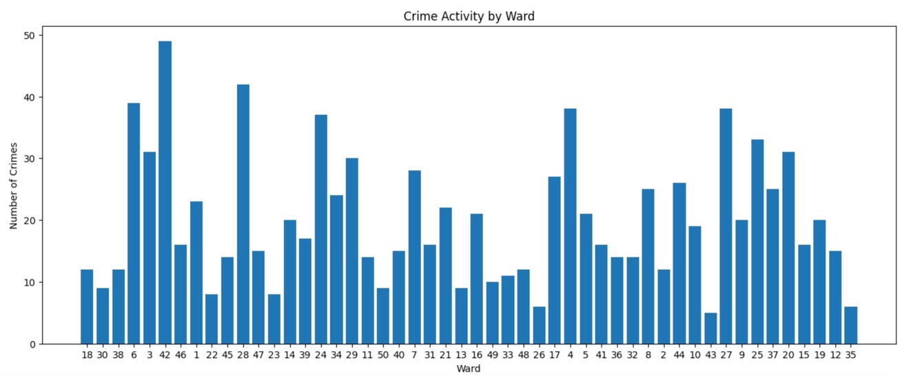
Within this bar graph, one will find a depiction of the amount of crime which occurred in each ward of the city. There are a number of takeaways which can be made from this graph. First of all, there are a selective number of wards which are abnormally high in crime rates, while some have seen almost no criminal activity. While there is a wide variety, there are extremes on both sides, and a general lack of consistency across the board.
Arrest Correlation to Time of Day
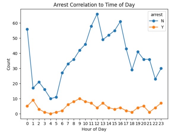
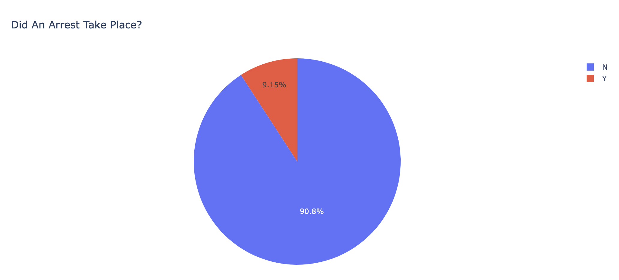
Here, we combined a pie chart which shows that a large majority (90.8%) of interactions do not result in an arrest with a scatter plot showing the ratio of arrests to non-arrests during all hours of the day. After demonstrating that most interactions do not result in an arrest, we dove further into the data. Despite a significantly larger amount of interactions in the middle of the day and early in the morning, there seems to be a small, but not very substantial, increase in arrests taking place during those time periods.
Top 5 Most Common Locations
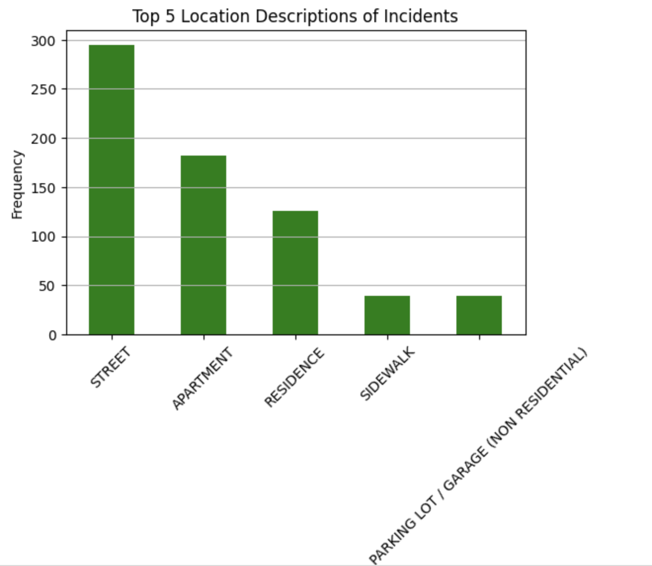
Top 5 Location Descriptions of Incidents: In this visualization, we have provided a bar chart of the top 5 locations of criminal activity occurrences based on frequency. From these, it is quickly evident that a very large amount of crimes are occurring within peoples’ abodes, whether that be listed as house, apartment, or residence. While it is not overly surprising that many crimes are happening at people’s residences, it is interesting that there are not also a significant amount of crimes happening in more public locations.